
Design and engineering are often treated as consecutive phases. Design defines the screen, then engineering makes it functional. That handoff misses the most useful part of interface design: a detailed interface is a map of product behavior.
Every state implies data. Every transition implies a contract. Every error message implies a failure mode the system must recognize.
Start with states, not screens
A screen is one moment in a workflow. A product also needs the moments before data arrives, after it changes, when a request fails, when a user lacks permission, and when no content exists.
Designing those states early forces useful questions. Can the action be retried? Is the update optimistic or confirmed? Does the user lose their input? Which values are server-owned, and which are local drafts?
If a dashboard must display partially available data, the API may need independent resources instead of one all-or-nothing response. If a form needs a recoverable draft, the product needs an explicit persistence policy. The visual state exposes the technical decision.
The best design specifications describe observable behavior, not pixels alone.
Let the interface shape the API
Consider a media tracker. The interface may show source metadata, private progress, a sync timestamp, and an update status. Combining everything into one anonymous object makes ownership unclear. Separating external source data from user-owned state produces cleaner endpoints and more predictable UI.
The same principle applies to errors. A generic 400 response may be technically accurate, but it gives the interface little to work with. Structured error codes let the product distinguish invalid input, an expired session, a duplicate record, and a temporary dependency failure. The message and recovery action can then match the real problem.
Consistency exists below the visual layer
Tokens for color, typography, spacing, and component variants reduce arbitrary visual decisions. A full-stack product also needs behavioral consistency. Pagination should behave the same way across resources. Validation should follow one model. Loading and retry logic should use shared patterns. Access checks should not be reinvented in individual routes.
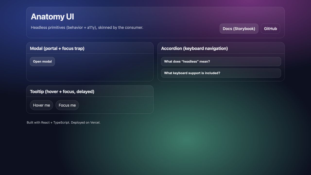
I think of these as system tokens: repeatable rules under the component layer. Anatomy UI explores this idea directly by separating behavior from appearance. Its modal owns focus management and dismissal rules without owning the final styling. Its accordion defines keyboard navigation without forcing a visual theme.
Prototype the risky transition
Teams often prototype the happy path because it is easiest to present. A better target is the transition with the most uncertainty: an optimistic update, a multi-step import, an AI suggestion that requires approval, or a workflow crossing several services.
The prototype does not need a complete backend. It needs realistic timing, believable data, and enough interaction to test the decision. Once the workflow is understood, its states can become acceptance criteria for implementation.
Keep design present during implementation
Implementation changes what is possible. Data arrives differently than expected. Mobile layouts expose missing priorities. Error handling adds states absent from the first flow.
My preferred workflow keeps design and engineering close: define the journey, model the states, establish the contracts, build a thin vertical slice, then review the real behavior. The result is not only a cleaner interface. It is an architecture shaped by the product it needs to support.
Related build: Open the Anatomy UI demo ↗