
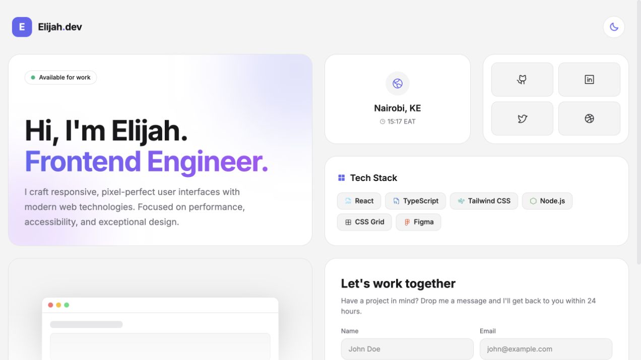
Bento layouts are easy to recognize and easy to imitate badly. A collection of rounded rectangles is not automatically a system. The useful design work is deciding which content deserves space, how panels relate, and what happens when the desktop composition collapses onto a phone.
The Bento Grid project uses a personal portfolio as the test surface: identity, availability, location, social links, technology, featured work, and contact.
Start with priority, not card size
The largest panel should not be large because the layout needs variety. It should carry the most important decision. In this case, the hero establishes identity and role, so it occupies a larger span. Location and social links are compact utilities. Technology needs width for scanning. Contact needs enough space for a real interaction.
Assigning spans after defining those roles prevents the grid from becoming decorative noise.
.bento-grid {
  display: grid;
  grid-template-columns: repeat(4, 1fr);
  grid-auto-rows: 180px;
  grid-auto-flow: dense;
  gap: 1rem;
}
Dense flow can fill gaps, but it does not replace intentional source order. The document still needs a logical sequence for keyboard navigation, screen readers, and narrow viewports.
Responsive layout is a recomposition
Shrinking every panel preserves geometry but destroys readability. The mobile version should become a clear linear narrative. Identity comes first, followed by context, proof, and contact. At tablet widths, two columns can preserve useful relationships without forcing desktop density.
The project defines those layout rules in CSS rather than relying on generated responsive utility names inside component strings. That keeps the critical grid behavior visible and predictable.
.bento-grid { grid-template-columns: 1fr; }

@media (min-width: 768px) {
  .bento-grid { grid-template-columns: repeat(2, 1fr); }
}

@media (min-width: 1024px) {
  .bento-grid { grid-template-columns: repeat(4, 1fr); }
}
Tokens keep variety coherent
A bento layout already contains strong visual variation. If every panel also invents its own color, radius, shadow, and text scale, the page loses a shared voice.
CSS custom properties provide a small contract for surfaces, borders, text, and accent color. The same tokens support light and dark themes by changing values on the root rather than rewriting each component.
Theme state lives at the application level because every panel needs the same mode. The user’s choice is stored locally, while the initial value respects the operating-system preference. This is a small example of lifting state to the level where ownership is clear.
Motion should explain affordance
Movement is most useful where it confirms interactivity: a project preview lifts slightly, a form reports submission state, and the live Nairobi clock changes because time itself is part of the content.
Those details are more convincing than animation applied to every panel. They connect movement to meaning and keep the layout readable for users who prefer reduced motion.
The grid is only the visible layer
The project also includes semantic landmarks, labeled form controls, controlled React inputs, icon links with accessible names, and a mobile-first reading order. Those details determine whether the composition remains usable after the novelty of the layout wears off.
A successful bento grid is not a bag of cards. It is a responsive information system: content priority becomes spatial hierarchy, spatial hierarchy becomes breakpoint rules, and those rules preserve a coherent story on every screen.
Related build: Explore the Bento Grid ↗