
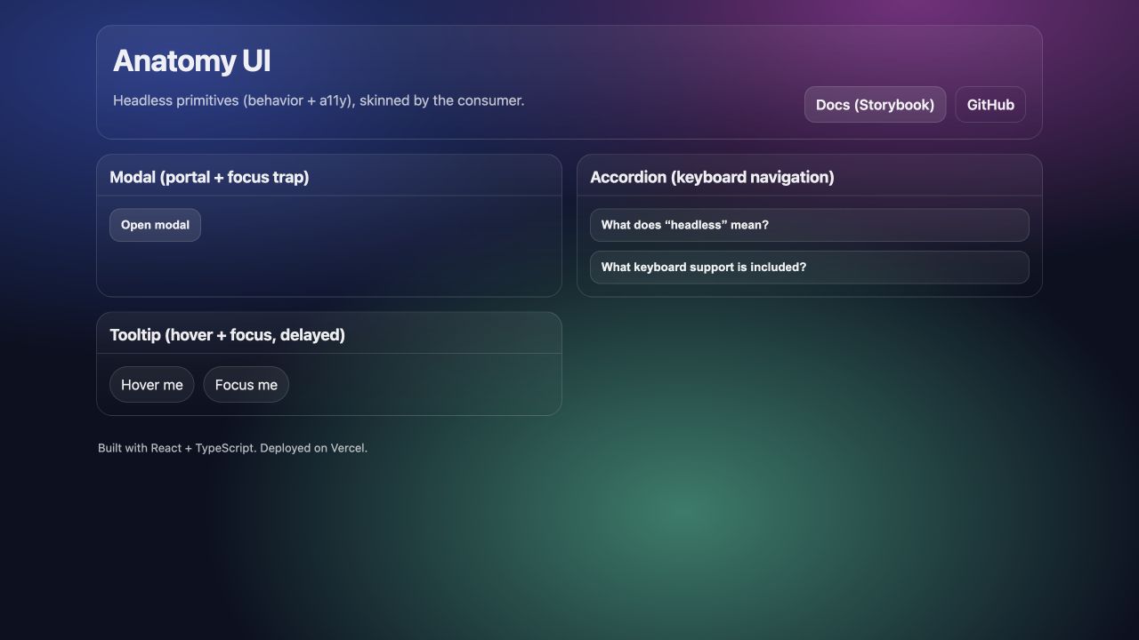
A component library can provide polished buttons and still leave the hardest interaction problems unsolved. Modals need focus management. Accordions need keyboard navigation. Tooltips need timing, positioning, and a relationship to their trigger that assistive technology can understand.
Anatomy UI explores those problems as headless primitives. The library owns behavior, state, and accessibility while the consuming product owns visual design.
Headless does not mean featureless
Removing styles should not remove the interaction contract. A headless modal still needs to render outside clipping containers, move focus into the dialog, trap focus while open, close according to an explicit policy, and return focus to the trigger.
The primitive becomes the modal’s brain. Product teams can apply any spacing, color, motion, or theme without rebuilding the underlying behavior for every project.
<Modal.Root>
  <Modal.Trigger>Open settings</Modal.Trigger>
  <Modal.Portal>
    <Modal.Overlay>
      <Modal.Content>
        <Modal.Title>Workspace settings</Modal.Title>
        <Modal.Close>Close</Modal.Close>
      </Modal.Content>
    </Modal.Overlay>
  </Modal.Portal>
</Modal.Root>
The compound-component API mirrors the meaningful parts of the interaction. That makes composition flexible while preserving a stable relationship between trigger, title, content, and close action.
Focus is application state
Focus is often treated as browser decoration. In a keyboard workflow, it is the user’s current position. Opening a modal changes that position. Closing it should restore the previous one. Pressing Tab should stay within the active dialog instead of moving into content hidden behind it.
That means focus handling belongs in the component’s state model. The implementation must identify focusable elements, handle empty or dynamically changing content, respond to Shift+Tab, and restore focus even when the dialog closes through Escape or an overlay click.
Treating focus as state also improves testing. Instead of checking only whether a modal exists, tests can verify where focus moves, whether it remains contained, and where it returns.
Keyboard behavior should be predictable
An accordion is visually simple but has a useful keyboard model. Enter and Space toggle a section. Arrow keys move between triggers. Home and End jump to the first and last trigger.
These conventions reduce the amount a user has to relearn. They also force the component API to distinguish visual order, open state, and active focus. Anatomy UI supports single and multiple open modes while keeping the keyboard contract consistent.
ARIA then communicates the same state through aria-expanded, aria-controls, aria-labelledby, and region roles. ARIA does not create behavior by itself. It describes behavior that must already work.
Tooltips are small state machines
Tooltips expose another kind of complexity. Hover should wait briefly so the interface does not flicker as a pointer crosses the page. Keyboard focus should open immediately. Pointer leave and blur may use a short close delay. Escape should provide a clear dismissal path.
Positioning introduces viewport boundaries. A tooltip requested above a trigger may need to flip below it near the top edge. Fixed positioning and getBoundingClientRect() are enough for a focused primitive, as long as collision behavior is documented rather than hidden.
Test contracts, not implementation details
The most valuable tests describe what a user can observe:
- Escape closes the modal.
- Tab remains inside an open dialog.
- Accordion triggers expose the correct expanded state.
- Arrow keys move between accordion headers.
- Tooltip content appears for both hover and focus.
Vitest and Testing Library make those contracts executable. Storybook provides the complementary visual sandbox, where consumers can inspect states and apply their own skin.
The larger lesson is that accessibility is not a layer added after a component looks complete. It is part of the product logic. Building it into the primitive once gives every interface above it a stronger starting point.
Related build: Explore Anatomy UI ↗